Shipped Title
Kindergo


Overview
Kindergo is a children's reading app with over 100,000 users and has been featured as app of the day several times.


"Creating magical reading moments"
ROLE
Game Designer
Research, wireframing, data analytics, visual design, prototyping.

Kindergo allows children to read through various, fully voiced, interactive books that are both fun and educational. To date there has been over 260,000 books read in over 90 countries!
Details
When I first started working on Kindergo it was a free to play game with 15,000 users. One of my responsibilities was to develop a monetisation model for the application.
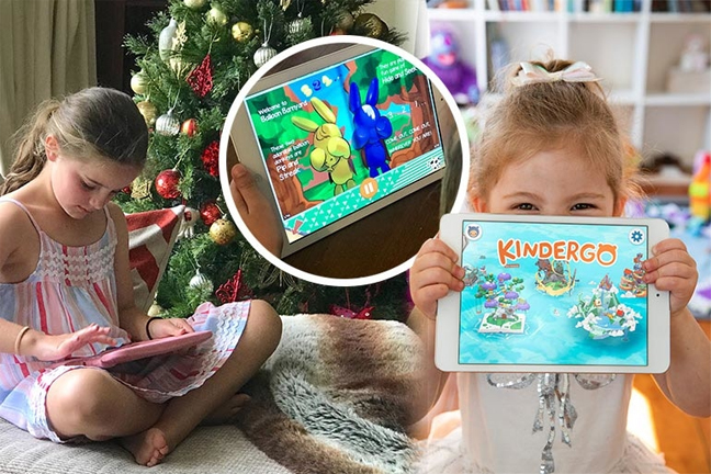
A unique problem with Kindergo is that when introducing a monetisation model, we actually need to satisfy two separate users.
Primary User:
Child
Secondary User:
Parent
Because of this, Kindergo required two User Experiences. While the existing design was great for the child's experience, it had to opposite effect for parents and guardians.
Analysis
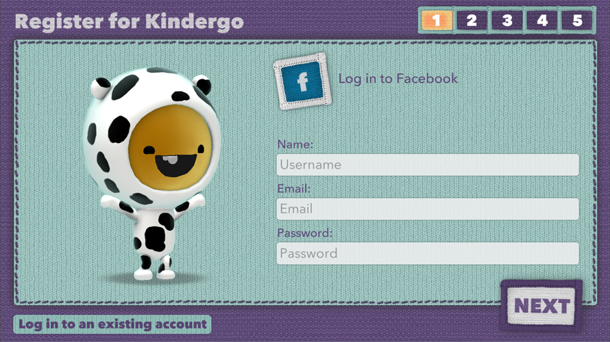
The original onboarding experience was created with the same design language as the rest of the application. Unfortunately, this created usability friction, including a 5 step sign up process that included 17 clicks.
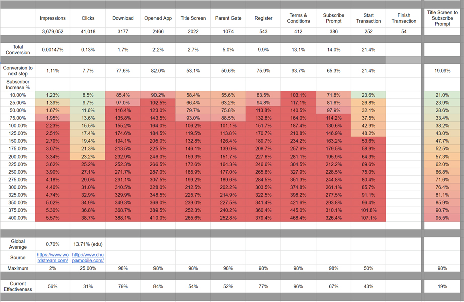
I took it upon myself to conduct a deep analysis of the user conversion funnel, identifying areas that required the most attention. This manual analysis collated date from all sources, and would not be possible in a single product.
Redesign
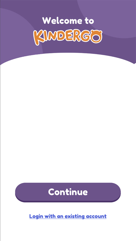
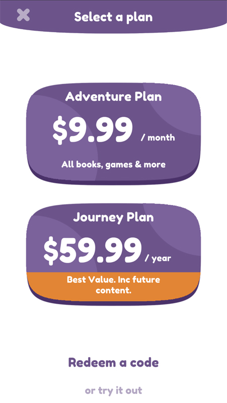
The entire onboarding experience was redesigned for parents specifically. Key points where a reduction in steps, more familiar design language and creating a dichotomy between portrait and landscape orientation depending on the user.
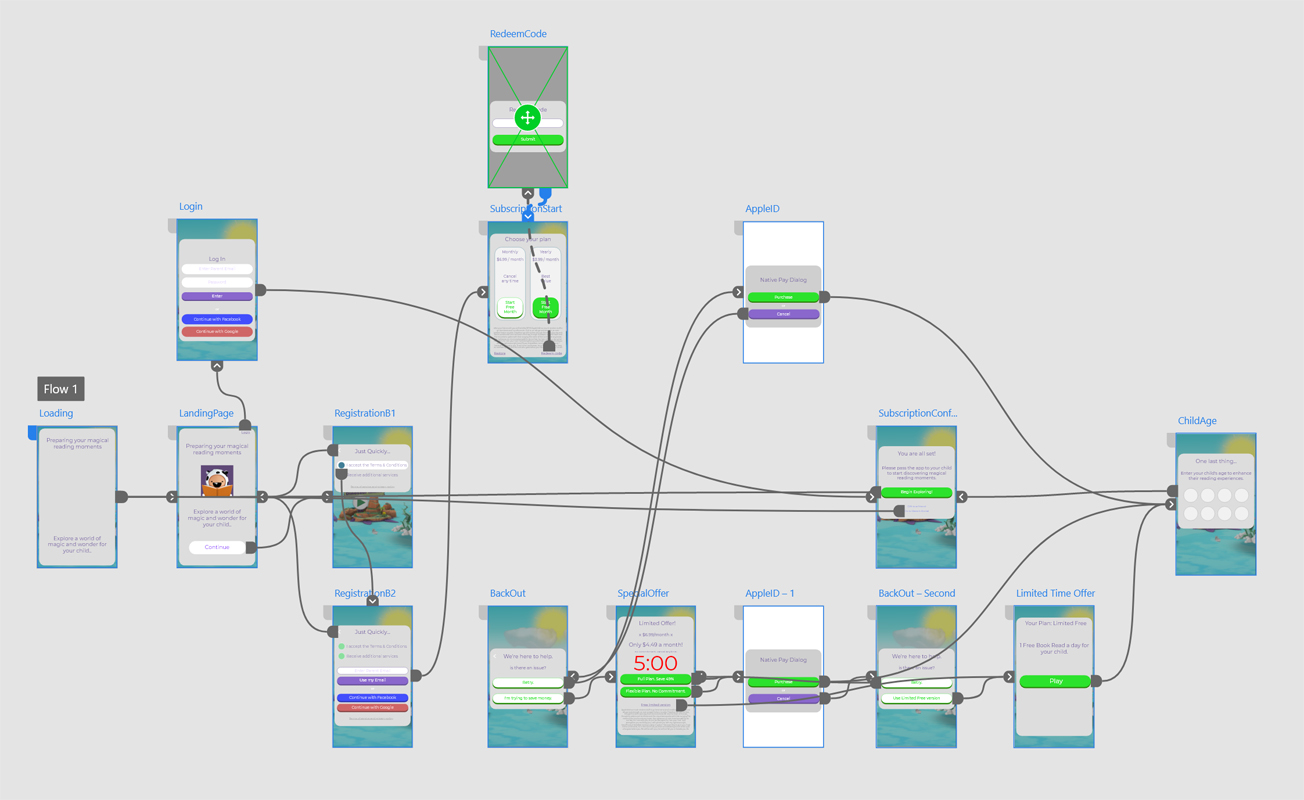
Using Adobe XD to quickly iterate through different onboarding experiences helped validate ideas internally in a fast manner. Early on it became apparent that mid-fidelity wireframing was more suitable for a highly visual application such as this, where the 3D and visual elements contribute to the experience.
Validation
In order to validate that the redesign was effective, I came up with a data taxonomy for the Amplitude Analytics product that was implemented into the application. Specifically we where looking for user conversion metrics.
1.2%
Paying conversion rate before redesign
7.99%
Paying conversion rate after redesign
This large increase in paying user conversion resulted in greater sales overall, and has help justified the continuing development of Kindergo.
I've outlined the onboarding redesign above, however this was not the only factor resulting in improved usability. Other things that where looked at included;
Learnings
Before I first came on, there was little preliminary research and limited data sets in which to evaluate the performance of the product. It wasn't even possible to assess at what level the product was performing.
The topics this project touched upon is vast, but the most important takeaway is to have a system in place where by one can accurately assess the well-being of the product.
This includes monitoring all aspects of the product including;
This framework allows a team to iteratively work towards a stronger product at an accelerating rate, as it also allows the team to change and adapt it's internal processes to better match the demands of incoming findings.


